THE ART FACTS
 1. The word we use to describe the area or room on a surface is space.
2. The subject or the emphasized part of a work of art is most often the positive space.
3. The space which is unused or is not emphasized in art work is most often the
negative space.
4. The space which is emphasized in a free standing sculpture is most often three-dimensional
space.
5. A continuous mark made by a moving point is called a line.
6. In free standing sculpture, the negative space is often made up of air or what
is behind the sculpture.
7. A line that directly crosses the page from left to right or right to left, is horizontal.
8. The word horizontal is derived from the word horizon.
9. A line that crosses the page directly from top to bottom is vertical.
10. A line that crosses the page from the lower left corner to the upper right is angular.
11. Lines that cross the page changing direction in smooth rounded paths are curved.
12. A word for a three dimensional shape is form.
13. A shape which is chaotic or irregular is a natural shape.
14. A cloud is an example of a natural shape or form.
15. A geometric shape has measured angles or curves.
16. A city outline is an example of a geometric shape or form.
17. A three-dimensional shape or form shows depth.
18. A two-dimensional shape is flat, as in a drawing of a square on a page.
19. A three-dimensional shape appears to have depth, as in a drawing of a cube on a page.
20. The two basic kinds of texture are visual and tactile.
21. The word "shiny" describes a visual texture.
22. The word "rough" describes a tactile texture.
23. The word "dull" describes a visual texture.
24. The texture have we in a photograph of sand paper is visual.
25. The word "furry" describes a tactile texture.
26. The shaded part of a picture that is dark and gets gradually lighter shows value.
27. White is one of the colors we would add to tint colors.
28. We can use a complimentary color to tone a color or to make it more brown and natural.
29. We can use grey to tone colors.
30. Hue is a word for the names of colors.
31. Blue is a primary color.
32. Green is a secondary color.
33. The acronym using the first letter of the primary and secondary colors in the color wheel is Roy G. Biv.
34. The first color at the top of the color wheel is yellow.
35. Yellow is not a secondary color.
36. Indigo is not a primary color.
37. Repetition is one of the ways to add unity to art work.
38. When a picture of a landscape includes elements which are correctly larger in the foreground, than the elements in the middle or
background, we call the elements proportionate.
39. One way to add unity to art work is to use proportion.
40. When the elements in a picture are correctly larger in the for-ground and smaller in the background we are using principle of art called
unity.
41. One of the ways to make the parts of a picture proportionate is to use two point perspective.
42. A word that means the same as the word 'contrasting' is the word 'opposite'.
43. The kind of balance which shows equal elements on the left and right sides of art work is symmetrical.
44. The kind of balance we have on the face of a clock or a round stained glass window is radial.
45. The kind of balance we find in a drawing of a leaning tree is asymmetrical balance.
46. One of the ways we can emphasis an element in art work is to color the element brightly.
47. One way to emphasis an element in art work is to use visual tricks.
48. When we locate the main point of interest slightly low and to the right of the center of a space, the pattern our eyes tend to follow is a
backward six pattern.
49. A staccato pattern is more noticeable and may keep our attention longer than a regular one.
50. One of the ways we show movement in art is to use repetition.
51. Our eyes tend to follow the direction of a pattern.
52. We create the feeling of rhythm in art by the use of patterns.
53. The space on a sheet of paper is two-dimensional.
54. When we say that most lines in nature are not real lines we are referring to an effect of the element called value.
55. The space on a block of marble is three-dimensional.
56. The two basic ways we describe the texture of an objects surface are visual and tactile.
57. The complimentary color of red is green.
58. The complimentary color of yellow is purple.
59. The complimentary color of blue is orange.
60. Most of the colors which enter our eye began as light from the sun or an artificial light source which then reflected off colored objects.
61. Two of the ways to add unity to art work are repetition and proportion.
62. The principle of art we are using when we use opposing elements to add variety, such as dark and light or sad and happy is contrast.
63. The kind of balance are we using in a drawing of a running man who is leaning forward is asymmetrical balance.
64. The kind of balance are we using in a drawing of the face of a single daisy flower is radial balance.
65. The kind of balance we are using in a centered drawing of a person with outstretched arms is symmetrical balance.
66. One way to add value is to make broad lines with a pencil on its side pressing harder opposite the light source and gradually pressing
lighter as you cross the shaded surface.
67. Values create the illusion of volume if they become gradually darker opposite from a light source.
68. One and two point perspective are used to make the parts of a picture the correct size or make them proportiionate.
69. The quality of color is determined by its location on the color wheel and/or how it is mixed with other colors.
70. The quantity of a color is determined by its tint or toned brilliance or light/dark gradation.
71. Sir Isaac Newton used a triangular prism to separate or refract white light into the visible spectrum.
72. Isaac Newton's refracted visible spectrum includes red, orange, yellow, green, blue, darkblue, and violet light.
73. The refracted spectrum can be collected with a converging lens which will yield white light.
74. Divide the spectrum into two parts such as red-orange-yellow and green-blue-violet, collect the two groups with a converging lens, and
the combination of the two mixtures will be white light.
75. Two kinds of colored light whose mixture with each other yields white are called complementary.
76. If we isolate one hue from the prismatic spectrum, for example green, and collect the remaining colors - red, orange, yellow, blue,
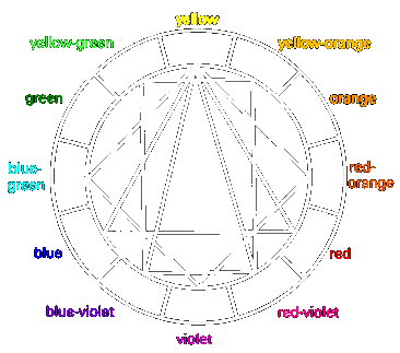
violet - with a lens, the mixed color obtained will be red.
77. Each spectral hue is the complement of the mixture of all the other spectral hues.
78. An object will appear "red" when light strikes an object which absorbs all the spectrum except the red.
79. Light which is reflected into our eye acquires human meaning or significance according to physical properties and our own
perceptions.
80. A Light-gray square looks dark on a white background; the same light-gray
square looks light on a black background.
81. A white square appears to be larger than a same size black square.
82. If we stare at a black or white square and close our eyes the after image will be the opposite as will colors reveal their complements.
83. If we stare at a medium gray square there is no after image and from this we can deduce that our brain seeks the equilibrium of
middle gray.
84. Two or more colors are mutually harmonious if their mixture yields neutral gray.
85. Most people who are not trained in color harmonies chose subjective harmonies which are their parent's or friends favorite colors, or
different colors of the same shade.
86. Color harmony can be explained objectively with the twelve part color wheel, Dyads, Triads, Tetrads according to Johannes Itten.
87. Any dyad pairs with their center in the middle of the color wheel are complementary.
88. Equilateral or isosceles triads can be rotated to reveal many combinations of harmonious groups of three within the color wheel.
89. Tetrad squares and rectangles contain two complementary pairs or a Harmony of four colors.
90. Yellow and violet form a harmonious dyad or complimentary pair.
91. Violet, orange and green form an equilateral triad harmony.
92. Yellow, red-violet, and blue-violet form an isosceles triad harmony.
93. Yellow, violet, red-orange, and blue-green form one of the three square tetrad harmonies.
94. Yellow, violet, orange, and blue form one of the rectangular tetrad harmonies.
95. Values can be used to create the illusion of volume and/or roundness.
96. Values can be used to create the illusion of distance or depth as in the sky becoming darker as it reaches farther up from the horizon.
97. Values can be used to create the illusion of distance as in the ground which is darker and more detailed at the base of a painting and
lighter toward the Horizon.
98. The four steps of drawing are to pick your tools, make a gesture drawing, make a shapes drawing, and draw the details.
99. A gesture drawing is used to see how a subject will fit on the page.
100. A shapes drawing is a map for the details.
Click here to see the ART POEM which
can help you learn the ART FACTS.
Return to syllabus.
Back